OVERVIEW
Delivering high quality engineered designs, top-tier products and iterating on their previous models, Miller Camera Support created impeccable products ready to be released into the world. From 2020 to 2021, Miller Camera Support introduced two groundbreaking product lines: the Solo-Q tripods and ArtX fluid heads.
As the sole visual designer, I led the creative direction for these high-profile releases, ensuring they met the high standards of Miller Camera Support while pushing the boundaries of innovation and design.
2020 | THE RELEASE OF THE SOLO-Q
PROJECT BACKGROUND
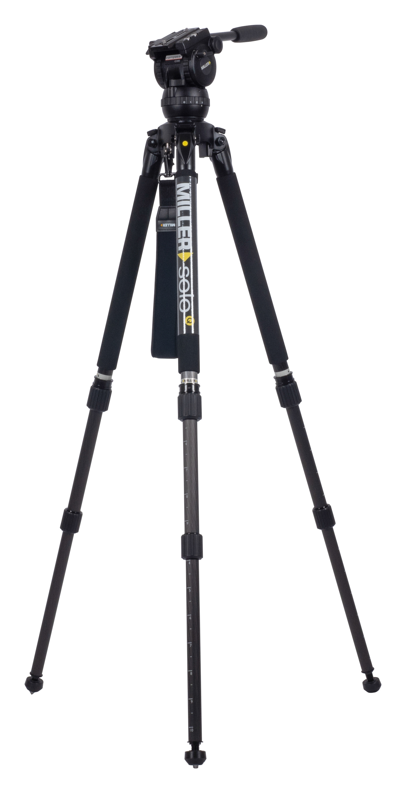
The Solo-Q tripods were developed as a successor to the highly successful Solo series, known for its speed and efficiency. The new line introduced advanced features like the Q-Lock, enhancing setup speed and versatility, making it ideal for both studio and on-location work.
"Solo, introduced by Miller in 2003, became an overnight success, as a sturdy, spreader-less, and lightweight tripod. In 2009, Rapid lock was announced, improving Solo’s speed of set up significantly. In 2020 Miller is now adding Q-Lock and renaming Solo to Solo-Q.
Solo-Q is a professional tripod, compatible with industry standard 75 & 100mm ball levelling pan and tilt heads. Although its design supports cameras in studio, it is ideally suited for on-location work because of its flexibility and portability. The creative design, precision manufacturing, and quality finish deliver rigidity, durability, versatility and longevity."
BRANDING DESIGN
Given the legacy of the Solo series, my challenge was to create a seamless brand identity for Solo-Q that both honored its predecessor and stood out as a modern update.
Design Guidelines and Decisions
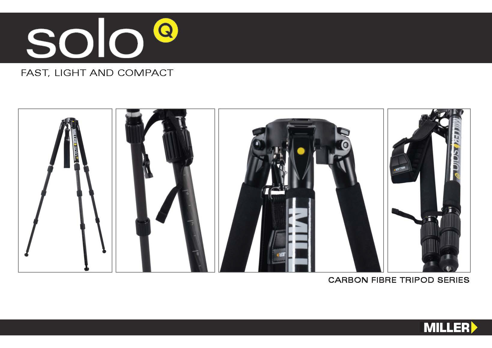
This started with creating a new logo incorporating the additional 'Q'. Since this release had a heavy emphasis of being the 2.0 of an already successful tripod, the 'Solo' was required to be the same but it could be adjusted to an extent for the 'Q'.
The original Solo logo was established in a light mode, meaning it was created to be printed on a white material wrap for the tripod. The updated logo transitioned to a dark mode for a sleek, modern look, aligning with current design trends and ensuring visual integration with the tripod's physical design.
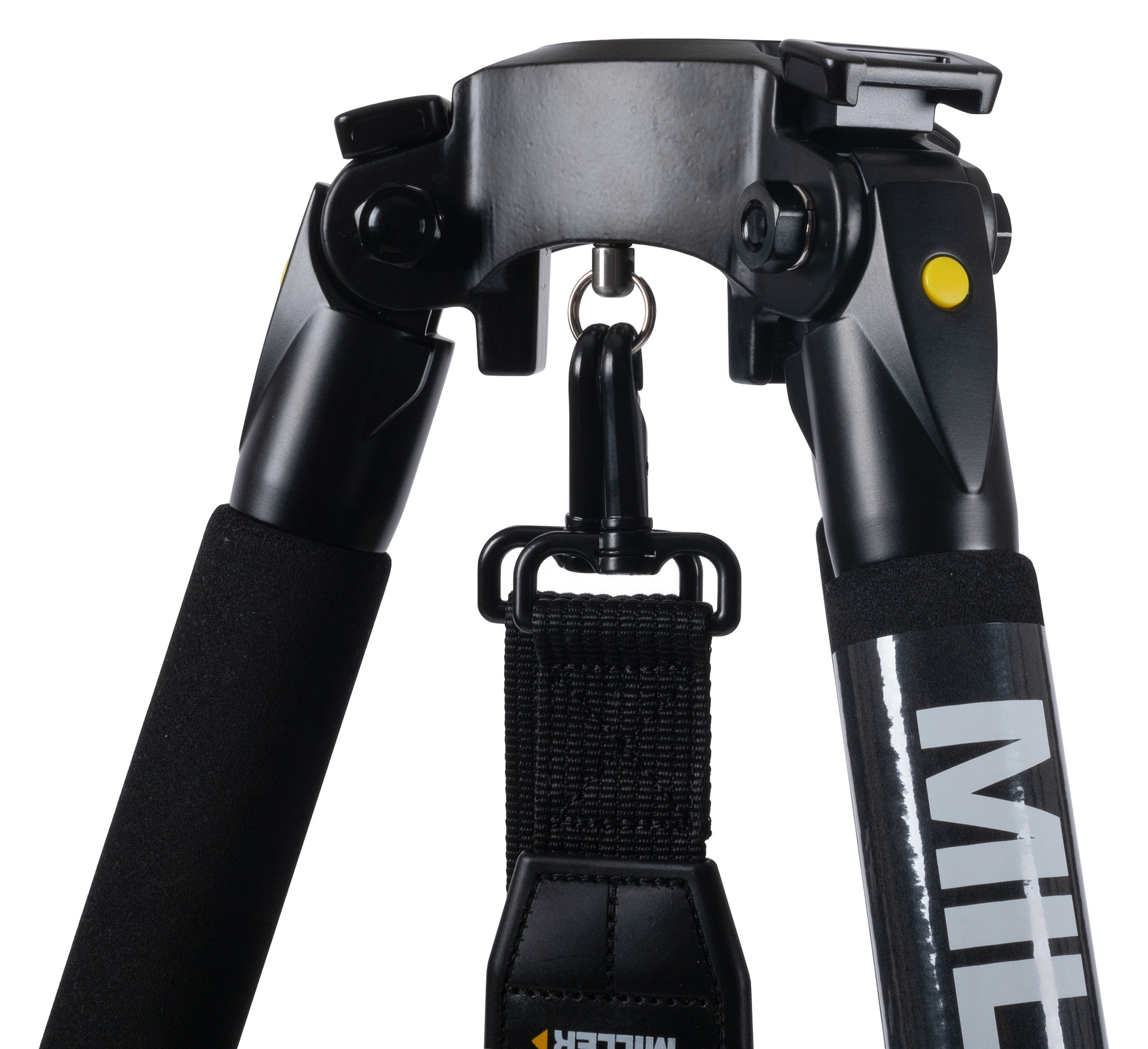
There was some room for me to experiment with how the 'Q' could be represented. It was important that it wouldn't be created without meaning. This amounted to the creation we landed on. The 'Q' was finalised to emulate the product's notable yellow button - the Q-lock which improved speed and efficiency. As the look of the Q-look was created first, the design had guidance to where it would land.

Product Execution
The finalized logo was meticulously prepared for printing, ensuring precise dimensions and placement alongside the Miller logo on the tripod legs. Detailed print proofs were reviewed to maintain quality and consistency.


Documentation
With each launch of a Miller product, Comprehensive documentation was essential to be provided to both the customers and dealers. The Documentation entails key items including Brochure and Short Form catalogue.
But first, an essential for these documents to proceed, the photography of the products must be done. Previously this task would be sourced externally, however due to my background and strong interest in photography, I took on this additional responsibility. I delivered high quality images which I then manipulated to market the Solo-Q.
To see the complete brochure documentation, click here.
2021 | THE RELEASE OF THE ARTX
PROJECT BACKGROUND
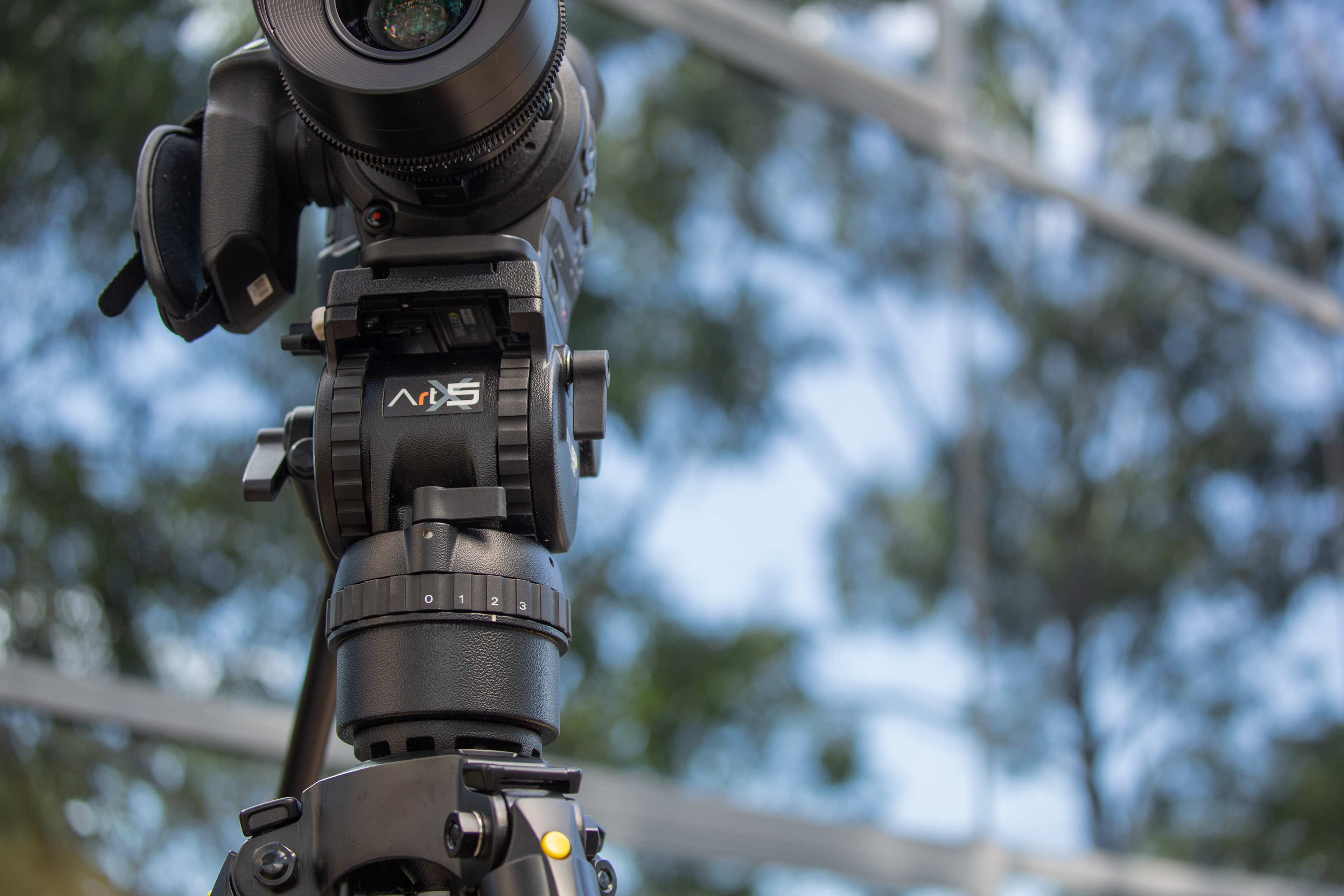
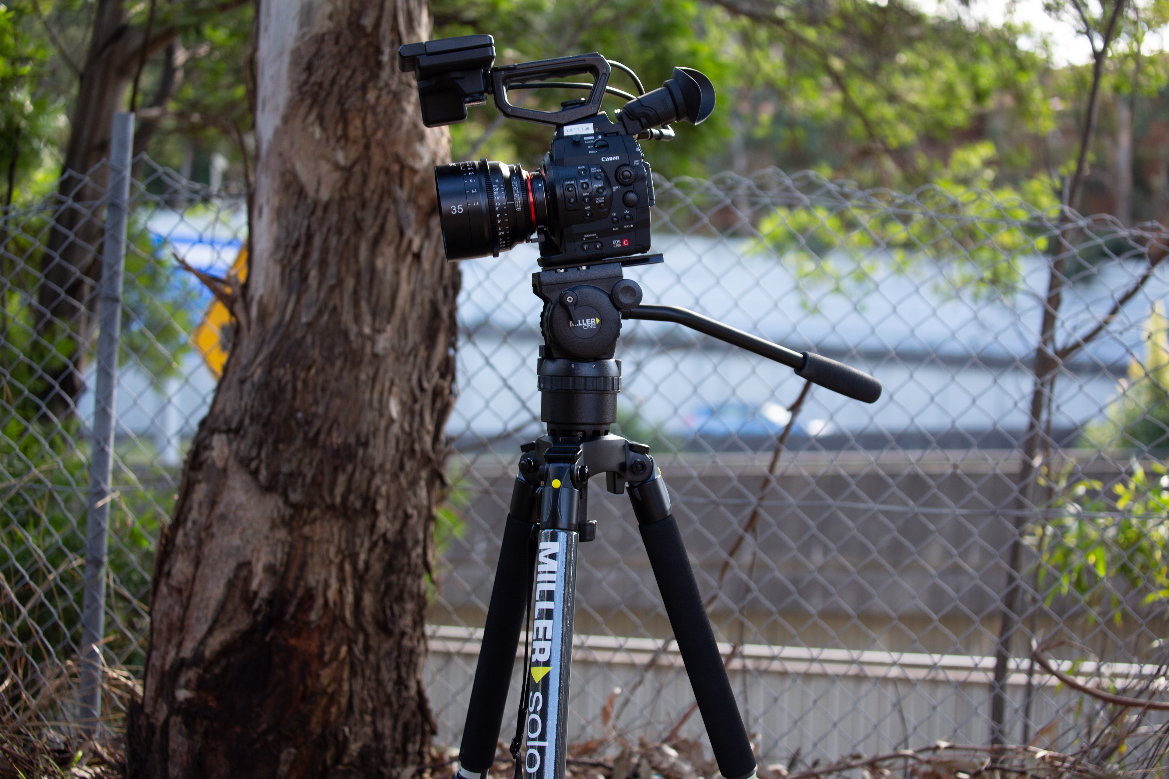
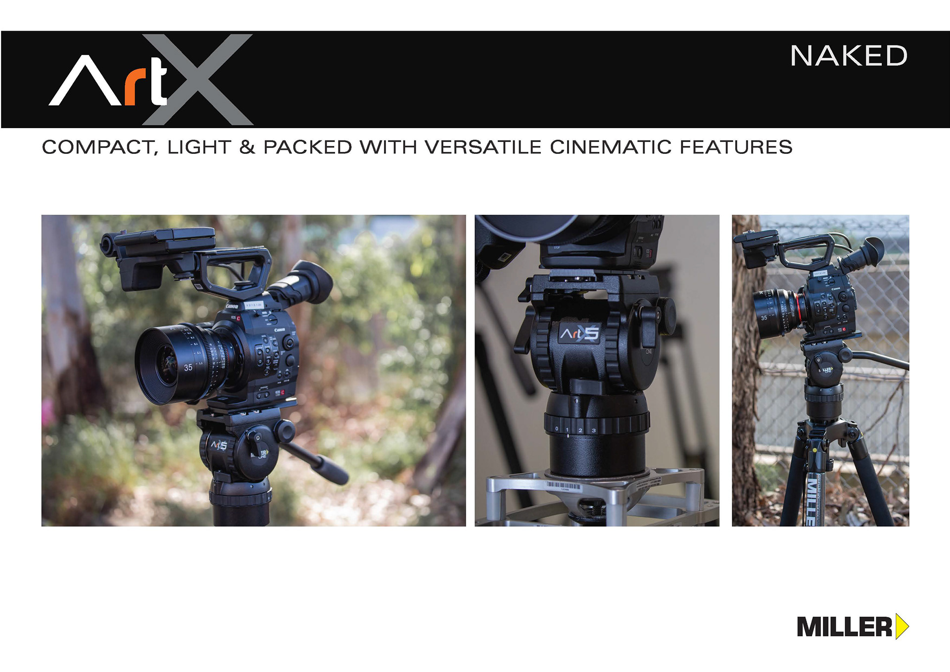
The release of these new fluid heads a product of wanting to creating something catering towards being compact, light & packed with versatile cinematic features.
"In its naked state the ArtX Naked allows to user to choose a sliding platform, pan handle and tripod attachment. The user who owns an inventory of peripherals has the capacity to customise the fluid head specifically for the requirements of the shoot.
ArtX delivers the ability to build a great set of tools which provides all the flexibility and versatility that may be desirable on different occasions. Don’t be hindered by your equipment make ArtX your choice to ensure optimal results."

BRANDING DESIGN
For this release where I lead the visual design for marketing the new product, it was different by the fact that it wasn't following any of the former fluid head releases by Miller. ArtX was a new name and brand adding entering into the company catalogue.
Design Guidelines and Decisions
Though there wasn't any 1.0 design to follow for the release of this line of fluid heads, it still had to maintain brand identity with the existing products. The fluid heads that were already in the Miller Camera Support roster did include names of a similar variety - ArrowX, CompassX, CiNX etc. With that in mind, it needed to be ensured that the logo for the brand new ArtX would perfectly fit in with the iconic Miller brand identity. These past fluid heads had used the insignia of 'X' as a common factor, though within the logo designs themselves, throughout each release they were utilised differently.
As CiNX was the latest fluid release, it was a unanimous decision to want to have the ArtX mimic this design more closely than the others. The CiNX's visual design had been moved to a more structured and straight line vision. This was a step in the right direction of image Miller wanted to portray for their future, in comparison to the ArrowX and CompassX which had a designed 'x' in a serif-style font with a curved motif.
Another important element to keep in mind was that the ArtX would be release in a series. where each fluid head was labelled a different number - ArtX 3, ArtX 5, and ArtX 7. The additional numbers needed to be included in the final decision in terms of placement and flexibility for the differing range.
The choice of colour for the letter 'r' was a design decision made in collaboration with the engineering team. That specific orange colour was used in the fluid head sliding platform plate that the ArtX fluid heads can be customised with.


Documentation
Similar to the Solo-Q product release, documentation such as a Brochure, Short Form catalogue, and more, were needed to complete the new release campaign.
One differing factor between the fluid head and tripod, is the additional documentation of an operator manual. The visuals were created in collaboration with the engineering team as specs are the highlight for this asset. The visuals they provided were high in detail and I was able to manipulate them to produce the best user-friendly outcome for this document.
KEY TAKEAWAYS
Leading the visual design for these major product releases at Miller Camera Support allowed me to refine my skills in branding, product design, and documentation. I navigated the complexities of maintaining brand consistency while introducing innovative design elements, collaborated closely with engineering and marketing teams, and ensured high-quality execution from concept to final product.
These projects highlight my ability to lead design initiatives, create cohesive brand identities, and deliver high-quality visual assets that drive product success.
Designed at Miller Camera Support by Gawshika Aumkaran