CONTEXT
Given a vast dataset, I embarked on the challenge of transforming intricate space-related information into logical, yet aesthetically pleasing visualisations. Focusing on Potentially Hazardous Asteroids (PHAs), I created visual representations that highlighted the fascinating subject and the finer details that classify an asteroid as a PHA. The project provided an opportunity to delve into space's spectacularly dangerous potentials, presenting the data in a consumable format.

... that's how this project started, and from here the only way is up, up and away.
Data Exploration & Discovery
Data Collection and Categorisation
The project began with the collection and categorisation of data. This dataset included elements such as type, change in velocity, group type, and estimated value from mining these asteroids. Information about orbits and physical parameters was sourced from the Minor Planet Center and NASA JPL. My goal was to make this data accessible and engaging, focusing on key elements that define PHAs.
Insights and Observations
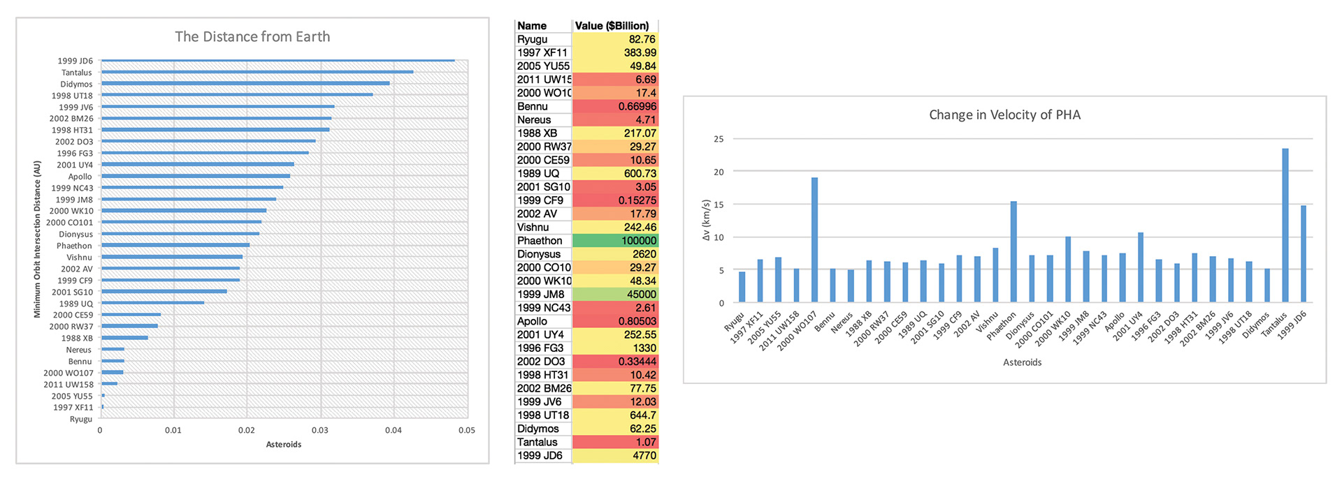
Through numerous testing and hours of browsing the dataset, I noticed repeating patterns and unknown abbreviations alongside the names in the column for the asteroid's group. This label coincided with the asteroid's speed/velocity, prompting further investigation. Additionally, I considered the asteroid's monetary value and their distance from Earth. These observations guided the direction of my visualizations.
Design Conceptualisation
Initial Ideation and Graph Testing
To convey the significance of PHAs, I experimented with various graph types to find the best way to highlight the data. The primary goal was to depict the connection between three important elements: classification, justification of PHAs, and their monetary value. By narrowing down the dataset, I identified three key graphs that effectively communicated these aspects.
Data Visualisation Design
The main message I aimed to convey was the significance of PHAs and their connection to Earth. My visualizations depicted the relationship between speed, distance, and monetary value, contributing to the classification and justification of PHAs. This phase involved creating detailed data exploration designs that laid the foundation for the final interactive visualization.
Final Interactive Visualisation
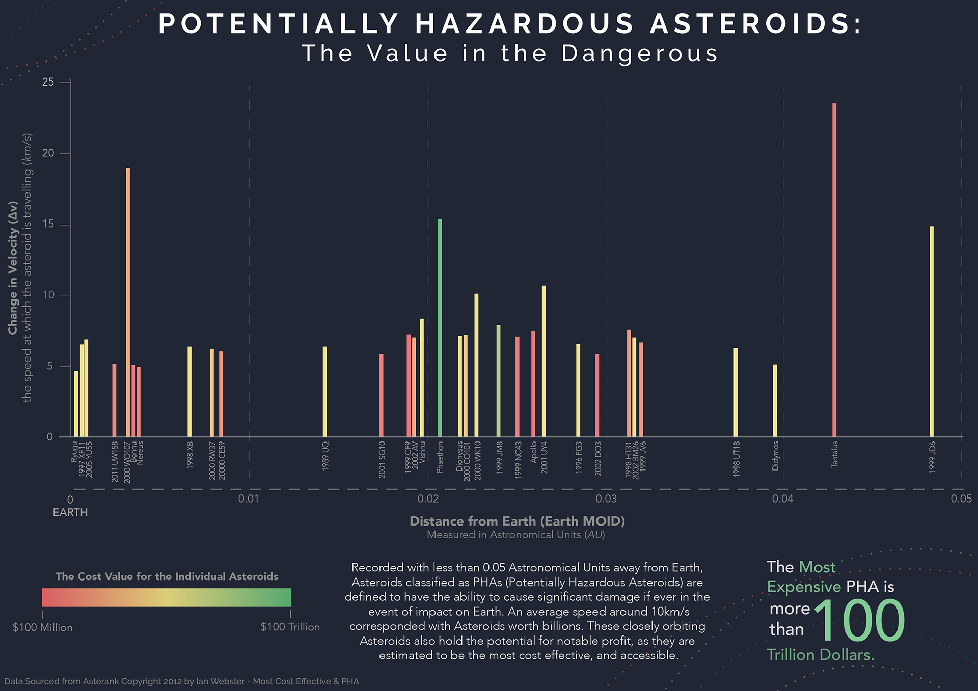
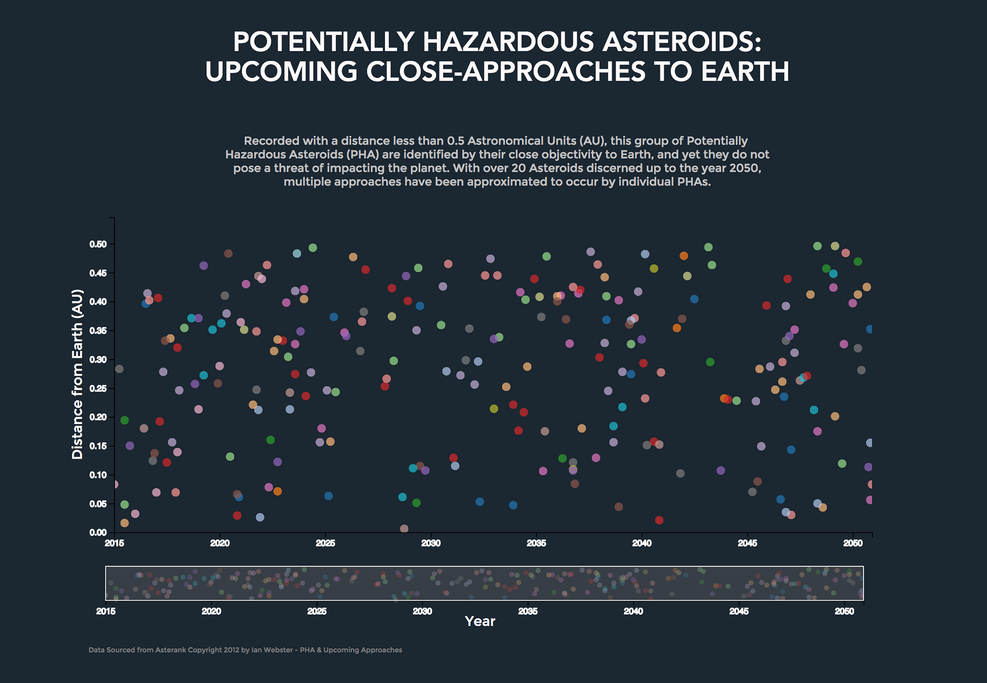
The final visualisation is an immersive and interactive graph that allows users to explore the intricacies of PHAs. The visualisation employs a series of coloured dots, each representing a specific asteroid. The dots are strategically placed on a graph where the x-axis denotes the distance from Earth and the y-axis represents the asteroid's speed/velocity. The size of each dot correlates with the estimated monetary value of the asteroid. This visual metaphor not only emphasises the hazardous potential of these asteroids but also highlights their economic significance.
The final visualisation is an immersive and interactive graph that allows users to explore the intricacies of PHAs. The visualisation employs a series of coloured dots, each representing a specific asteroid. The dots are strategically placed on a graph where the x-axis denotes the distance from Earth and the y-axis represents the asteroid's speed/velocity. The size of each dot correlates with the estimated monetary value of the asteroid. This visual metaphor not only emphasises the hazardous potential of these asteroids but also highlights their economic significance.
HOW DOES IT WORK?
Hover over the dots to identify the specific asteroid.
Get a closer look by changing the size of the bar at the bottom.
Drag that bar across to view various potentially hazardous asteroids.
The repetitive nature of a unique coloured dot throughout the width of the graph implies the frequency of its approaches to Earth over a large number of years. A single colour correlates with one specific asteroid. The distance from the x-axis measures and compares how close that asteroid is to Earth (0.00)
Key Takeaways & Future Directions
Participating in this project provided invaluable insights into data visualization and UX methodologies. Transforming complex data into engaging visual representations was both challenging and rewarding. Moving forward, I am eager to apply these learnings to future projects, advocating for continued innovation and user-focused solutions that elevate digital experiences across diverse fields.
Participating in this project provided invaluable insights into data visualization and UX methodologies. Transforming complex data into engaging visual representations was both challenging and rewarding. Moving forward, I am eager to apply these learnings to future projects, advocating for continued innovation and user-focused solutions that elevate digital experiences across diverse fields.
Created by Gawshika Aumkaran