OVERVIEW
Imagine being tasked with rekindling the excitement in people who once loved your product but have since drifted away. That was our mission with Foxtel Now: to bring back customers who had left the service, and to do so in a way that felt seamless and engaging. We aimed to create a flow that would welcome them back with open arms, making it easy for them to pick up right where they left off.
Foxtel Now, a beloved streaming service (in conjunction with Foxtel iQ), faced a common challenge: reactivating former users. The business identified this as a crucial area for improvement, and our goal was to design a user-friendly reactivation process that would make it simple and appealing for users to return.

Problem Space
The challenge was clear: create a seamless flow to re-engage users who had paused or canceled their subscriptions. This wasn't about understanding why they left but about offering a smooth path back into the service. It was about achieving a cohesive platform that would cater towards this niche of an audience.
Contextual Research
This project began with an extensive initial UX research phase to understand how to design the best possible reactivation flow. The main UX research and discovery methods used included group surveys, one-on-one user interviews, and card sorting, especially for exploring UX copywriting. Here's how it was tackled:
Initial Surveys: The initial surveys cast a wide net to capture a general understanding of users' attitudes toward streaming services and subscription management. We distributed the surveys to both past Foxtel Now subscribers and current Foxtel iQ users, aiming to learn more about general behaviours and pain points in their subscription experiences. I also sent out another minor round of questionnaires to gain the perspective of users who have had the general experience of returning to a product/platform that they has cancelled.
Initial Surveys: The initial surveys cast a wide net to capture a general understanding of users' attitudes toward streaming services and subscription management. We distributed the surveys to both past Foxtel Now subscribers and current Foxtel iQ users, aiming to learn more about general behaviours and pain points in their subscription experiences. I also sent out another minor round of questionnaires to gain the perspective of users who have had the general experience of returning to a product/platform that they has cancelled.
Key Observation: A recurring theme among responses was the need for transparency in pricing and subscription options. Users expressed frustration about not knowing exactly what they were reactivating into, especially if prices or plans had changed since they last subscribed.
Semi-Structured Interviews:
The focus was refined to have conversations which revealed personal stories and experiences highlighting what could make returning to the service more appealing and seamless. Open-ended questions were asked, allowing users to share their thoughts freely while guiding the discussion to gather specific insights. These groups included current and former Foxtel Now users, people who had used other Foxtel products, and those generally aware of Foxtel. There was also a round of interviews looking into users who have had this general experience of returning to a product they had previously used and then cancelled. These targeted approaches allowed us to delve deeper into individual experiences and pain points. I was fortunate to have the assistance of a Design Intern to revise the data gathered for thorough analysis.
The focus was refined to have conversations which revealed personal stories and experiences highlighting what could make returning to the service more appealing and seamless. Open-ended questions were asked, allowing users to share their thoughts freely while guiding the discussion to gather specific insights. These groups included current and former Foxtel Now users, people who had used other Foxtel products, and those generally aware of Foxtel. There was also a round of interviews looking into users who have had this general experience of returning to a product they had previously used and then cancelled. These targeted approaches allowed us to delve deeper into individual experiences and pain points. I was fortunate to have the assistance of a Design Intern to revise the data gathered for thorough analysis.
Key Observation: During these interviews, many former subscribers shared that they found the reactivation process “tedious” or “repetitive.” Specifically, they disliked having to go through multiple pages of input fields that included information they had already provided in their initial sign-up. They expressed a desire for a simpler, faster route to resume their subscription without redundant steps.
Card Sorting:
With card sorting sessions, it was particularly valuable for exploring UX copywriting. This helped us understand how users naturally categorised and prioritised information, which was crucial for simplifying navigation and improving clarity in key areas like the information and purchase pages. As there was potential to update other facets of the checkout flow, the wording was considered important. It was fortunate to have a copywriter on the team to work with on for this particular activity - to getter a better understanding on the nuances.
With card sorting sessions, it was particularly valuable for exploring UX copywriting. This helped us understand how users naturally categorised and prioritised information, which was crucial for simplifying navigation and improving clarity in key areas like the information and purchase pages. As there was potential to update other facets of the checkout flow, the wording was considered important. It was fortunate to have a copywriter on the team to work with on for this particular activity - to getter a better understanding on the nuances.
Key Observation: The card sorting sessions revealed that users found certain terminology confusing or too harsh, especially phrases like “reactivate subscription,” “renew,” and “resume.” Many participants preferred simpler, direct language such as “Save Now” or “Restart Your Subscription,” which felt more engaging and welcoming.
Analysis of Research Findings:
To make sense of the collected data, I began with affinity diagrams, grouping similar observations and insights to identify recurring themes and user needs. This method helped me distill complex information into clear patterns, allowing me to prioritise design decisions based on user pain points and desires.
To make sense of the collected data, I began with affinity diagrams, grouping similar observations and insights to identify recurring themes and user needs. This method helped me distill complex information into clear patterns, allowing me to prioritise design decisions based on user pain points and desires.
From there, I crafted detailed personas representing the key user segments, including existing, new, and potential reactivating customers. These personas served as my guiding compass throughout the design process, ensuring my solutions remained user-focused. I also developed user journey maps that visualised the end-to-end experiences for each persona, highlighting their touchpoints, potential frustrations, and opportunities for enhancement. This deep dive into user behaviour equipped me with a strong foundation for designing a reactivation flow that felt intuitive and responsive to real user needs.
Key Insights:
• Users wanted an easy, streamlined, and intuitive way to manage their subscriptions.
• Simplifying navigation through different pages, especially during reactivation, was essential.
• The existing user interface was not as user-friendly as it could be, leading to potential drop-offs during reactivation.
Design and development Phase
Wireframing and Prototyping
With our research insights in hand, we set out to design a solution:
• Wireframing: Started with low-fidelity wireframes, outlining the new reactivation flow. Our goal was to make subscription management easier and address the pain points identified in our research.
• User Testing: We developed low-fidelity prototypes for the areas targeted in our research, such as the login page and checkout flows, and conducted further semi-structured interviews. This allowed us to observe how users interacted with the prototypes and gather direct feedback on the designs.
Identified Areas:
Through extensive research and stakeholder meetings, we identified key areas to focus on:
• Login Page
• Information and Purchase Pages
• Home Screen
• My Account Section
• Checkout Flow for Reactivating Customers
With identifying several critical touchpoints, the decision to focus on specific user journeys—such as existing customers, new customers, reactivation via CTA, EDM, bundle selections on the homepage, and others—was driven by a need to address the varied paths users might take when re-engaging with Foxtel Now. Each journey was chosen based on its potential to reduce friction and enhance user motivation at key decision points. By targeting these areas, we aimed to create tailored experiences that not only met business requirements but also aligned with human-centred design principles, ensuring the users felt understood, supported, and encouraged at every step of their reactivation process. Our goal was to provide clear, engaging, and personalised pathways that seamlessly integrated with the broader platform redesign, ultimately making the reactivation experience as smooth and intuitive as possible.
User Journeys Targeted:
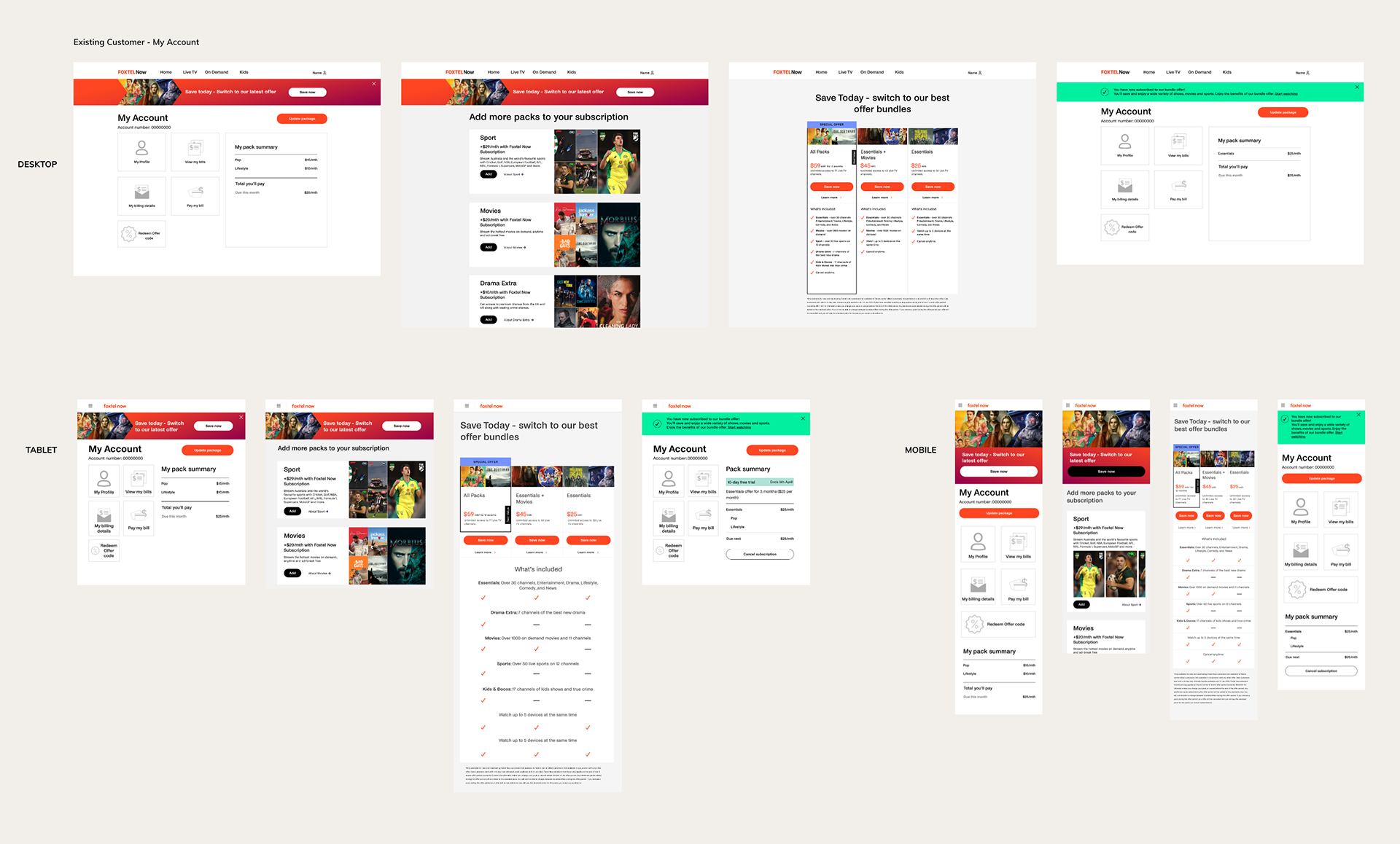
1. Existing Customer: For existing customers, the reactivation flow was designed to seamlessly integrate with the broader interface redesign across the platform. This ensured consistency and familiarity in the user experience, making the transition smooth for users who were already accustomed to the previous interface. We focused on reducing friction points, such as simplifying the navigation and enhancing visual cues to guide users effortlessly through the reactivation process.
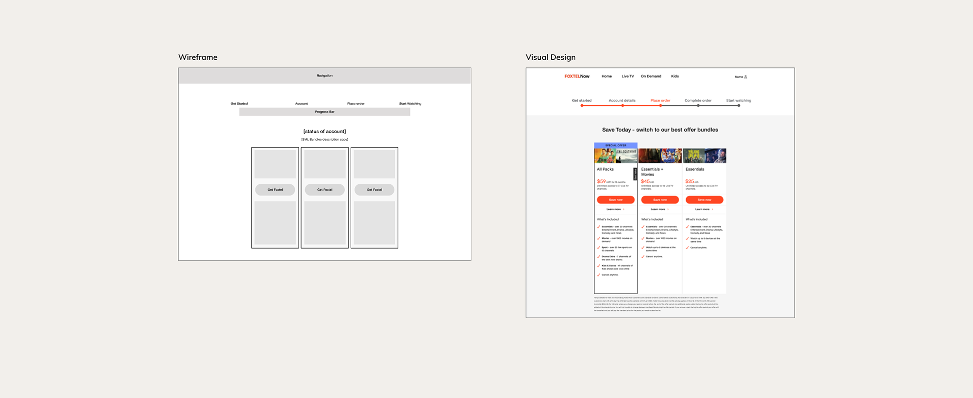
NOTE: An example of really utilising the user research and ideating based on data-driven design is the Comparison Model - the table of three columns showcasing the sales bundles. Based on the feedback, we prioritised creating a clear, upfront display of subscription plans and costs on the reactivation pages. In the wireframes and prototypes, I ensured that the comparison section was highlighted early in the reactivation/checkout process, with detailed descriptions for each plan in a cohesive set-up to easily compare with one another. This focus on transparency was essential for building user trust and reducing hesitancy the user's choice. There was also strong consideration for the responsive design when viewed on smaller devices i.e. mobile and tablet. Considering the size allowance, the table would shift to be more visual, utilising icons as the comparison.
*including the responsive designs for this flow as an example
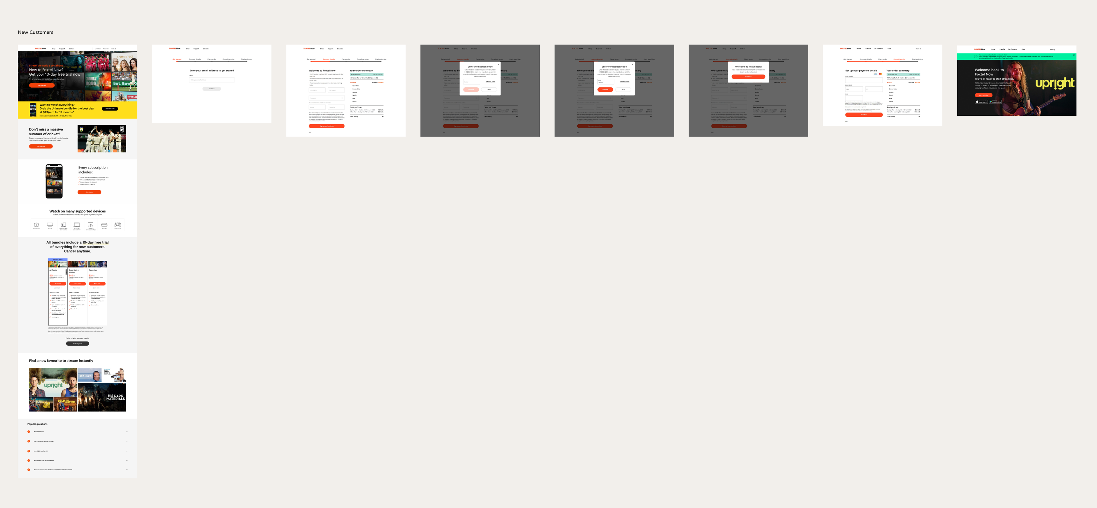
2. New Customer: The new customer journey was tailored to make onboarding as intuitive and welcoming as possible. By aligning this flow with the overall platform redesign, we ensured that first-time users would have a coherent experience from the moment they landed on the site. The goal was to create a straightforward path from exploring the service to completing their subscription, with clear calls to action and helpful prompts along the way.
3. Reactivation by CTA: For users reactivating through specific call-to-action buttons, we designed targeted flows that would quickly guide them from initial interest to reactivation. These flows were optimised to minimise steps and highlight the benefits of returning, using persuasive design elements and personalised messaging to capture the user's attention and encourage a quick decision.

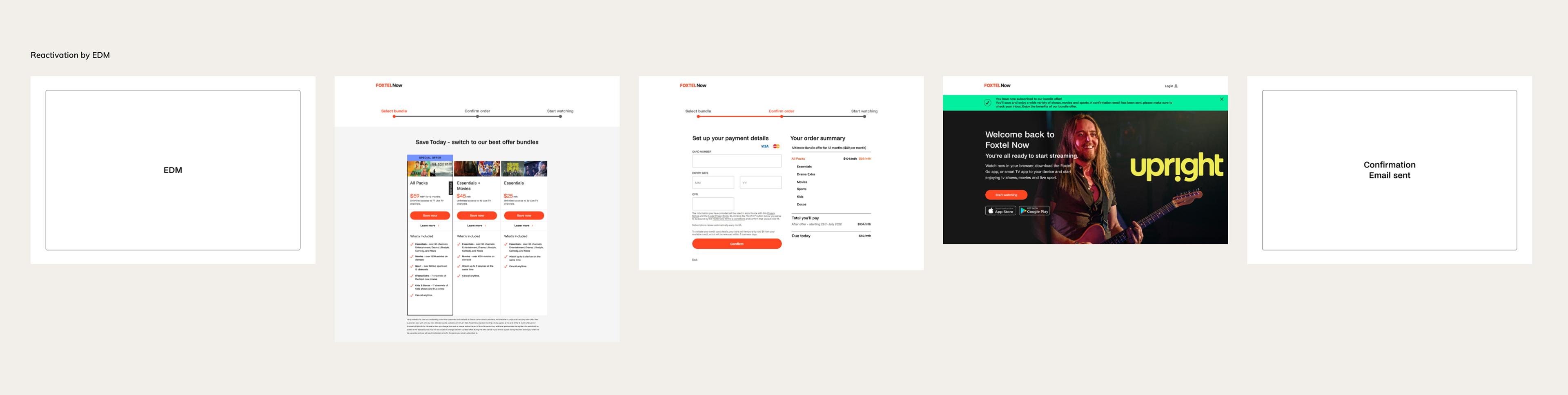
4. Reactivation by EDM: The reactivation journey via email direct marketing (EDM) was crafted to re-engage users through personalized email campaigns. This flow included clear, enticing links that directed users straight to their reactivation options, making the transition from email to the platform as seamless as possible. We emphasised quick access to account recovery and special offers to drive conversions from these campaigns.
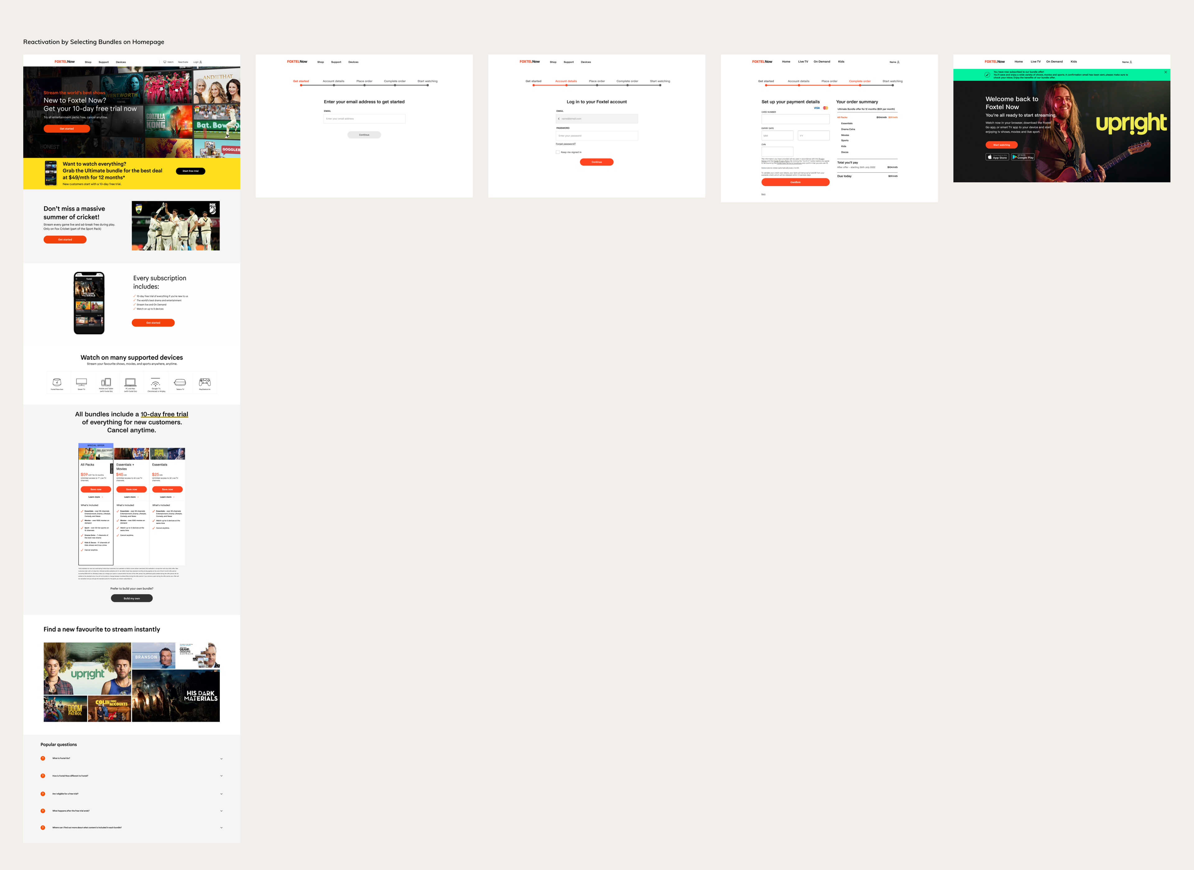
5. Reactivation through Selecting Bundle on Homepage: This journey was tailored for users who showed interest in reactivation by exploring bundles directly from the homepage. The flow guided them through the selection process, clearly presenting the value of each bundle and making it easy to understand the options. By focusing on clarity and simplicity, we aimed to reduce any hesitation and encourage immediate reactivation from the homepage itself.
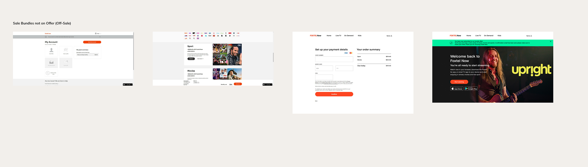
6. Scenario of Reactivation where Sale Bundles Aren't on Offer: In cases where promotional bundles were not available, we designed a flexible reactivation flow that still highlighted the value of returning to Foxtel Now. This included alternative offers, such as discounts on standard plans or highlighting unique content that would appeal to the user. The aim was to keep the experience positive and persuasive, even without the lure of a sale bundle.
7. Reactivation via Logging In: For users who reactivated simply by logging in, the process was made as straightforward as possible. We streamlined the login experience, ensuring that upon entering their credentials, users were greeted with a welcoming and clear prompt to reactivate their account. This approach focused on reducing the effort required from the user, making it a frictionless path back to enjoying Foxtel Now.

Simultaneously Updated Designs:
• Order Summary Cart
• Log In - Email Confirmation
• Home Page
• Shop Page

Example shown - 'Order Summary Cart'
Final Deliverables
Visual Design:
Our final visual design incorporated all the feedback from our testing phases. We created a clean, intuitive interface that made subscription management easier and ensured a seamless reactivation process. Throughout the various iterations of the designs, significant changes were consistently put through usability tests and feedback-gathering sessions with users. This involved user interviews and usability testing to refine and validate the designs at each stage.
A key factor in our final design decisions was ensuring that the new features seamlessly integrated with the current website’s existing design and style, as this was not a complete overhaul of the user interface but rather an enhancement and extension of what was already in place.
Additionally, it was crucial to design responsively, catering to desktop, mobile, and tablet users alike. By focusing on a responsive design approach, we ensured that the reactivation flow and all related interfaces provided a consistent and optimal experience across all devices. This allowed us to meet users where they were, whether they were on the go with their mobile devices, browsing on a tablet, or sitting at their desktop, ultimately supporting a more inclusive and accessible experience for all users.
Collaboration with Developers:
We worked closely with the development team to bring our designs to life. Regular testing and validation ensured that any issues were addressed promptly, leading to a smooth implementation.
Key Findings from Design and Developments:
• Login Page: Users appreciated a more straightforward login process, making it easier to access their accounts and manage subscriptions.
• Information and Purchase Pages: Simplified and clearer information made it easier for users to understand their options and make informed decisions during reactivation.
• Home Screen: The redesigned home screen was welcoming and intuitive, encouraging users to explore content and engage with the service.
• My Account Section: Enhanced navigation and clarity in the account section improved the overall user experience in managing subscriptions.
• Checkout Flow for Reactivating Customers: Streamlined checkout processes reduced friction and facilitated a smoother reactivation experience.
KEY TAKEAWAYS
Reflecting on this project, several key takeaways emerged:
• User-Centric Design: By focusing on user needs and feedback, we were able to create a reactivation flow that was not only functional but also engaging and user-friendly.
• Iterative Process: Continuous testing and iteration ensured that our designs evolved based on real user feedback, leading to a polished final product.
• Collaboration: Close collaboration with stakeholders, developers, and users was key to the success of this project. It allowed us to align business goals with user needs.
• Human-Centred Design Principles: Leveraging human-centred design principles, such as empathy and inclusivity, ensures that thw designs were not only practical but also resonated with the users on a personal level.
This project not only tackled a significant business challenge but also honed my skills in UX research, design iteration, and cross-functional collaboration. The result was a thoughtfully crafted reactivation flow that significantly improved the user experience for Foxtel Now customers.
Designed by Gawshika Aumkaran at Foxtel Group