DESIGN BRIEF
The goal for this project was to create a recognisable logo that represents the stronger traits of the brand in question. A 'mock' company was provided to re-brand and revitalise their identity to appeal to a broader and more modern audience.
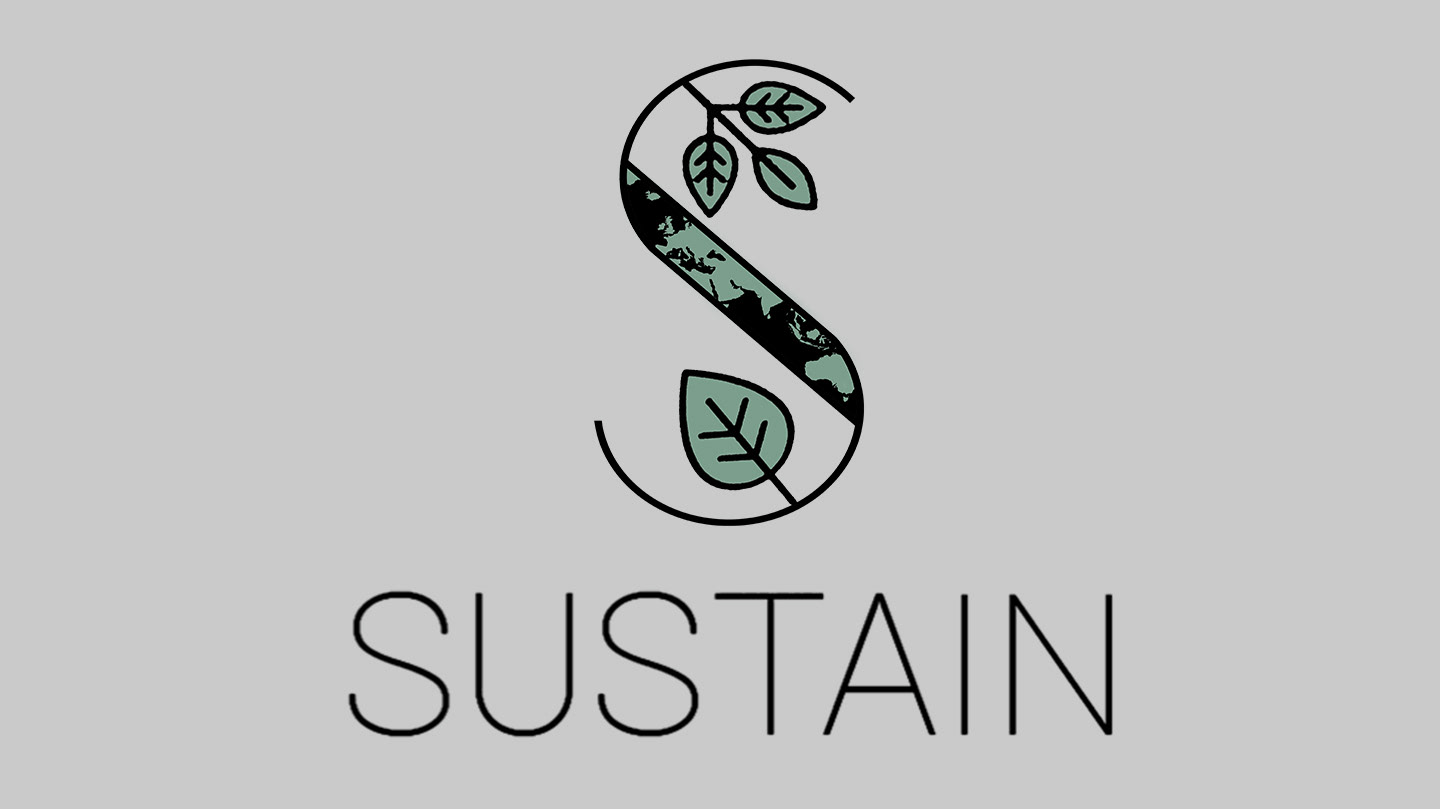
The company, Sustain, is a fast food chain of sustainably sourced foods and packaging products. Sustain stands on the value of providing products that are 100% organic and use sustainable farming practices.
DESIGN BRIEF
The task was to create a logo that embodies 'organic and living', show how eco-conscious the brand is, and make the logo 'stand for' the company. Key words such as earthy, hip, eco-conscious and lifestyle were thrown around to further insight insight the identity the logo and the brand were to stand for.
SOLUTION
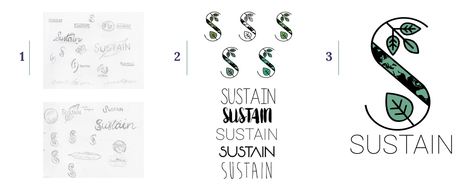
Key elements of my branding design that I believe embody the design brief were:
an 'eco-conscious' map of the earth in the middle, the leaf/plant components (they're connotative to the culinary aspect of the company), selective colour palette and the font choice.
LOOKING BACK
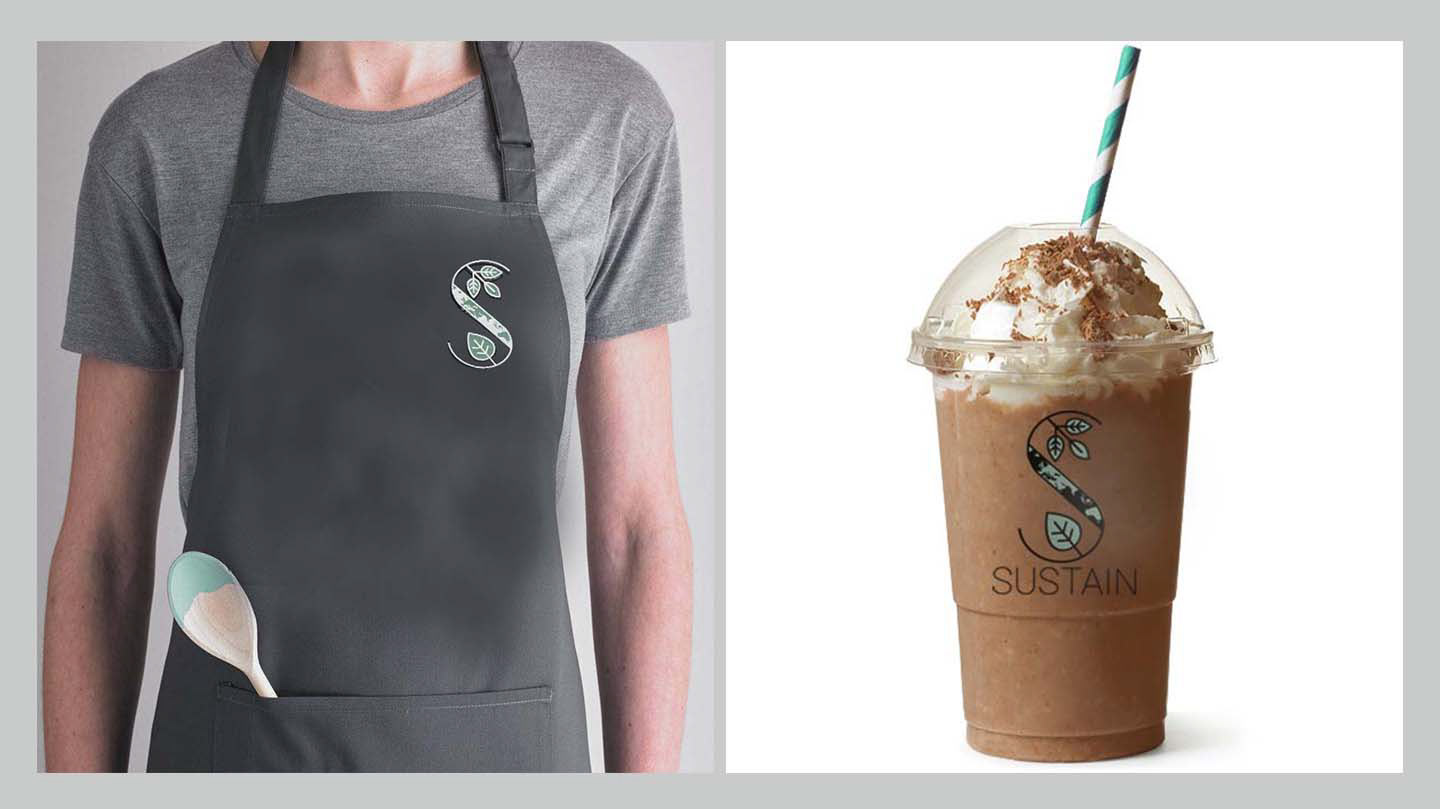
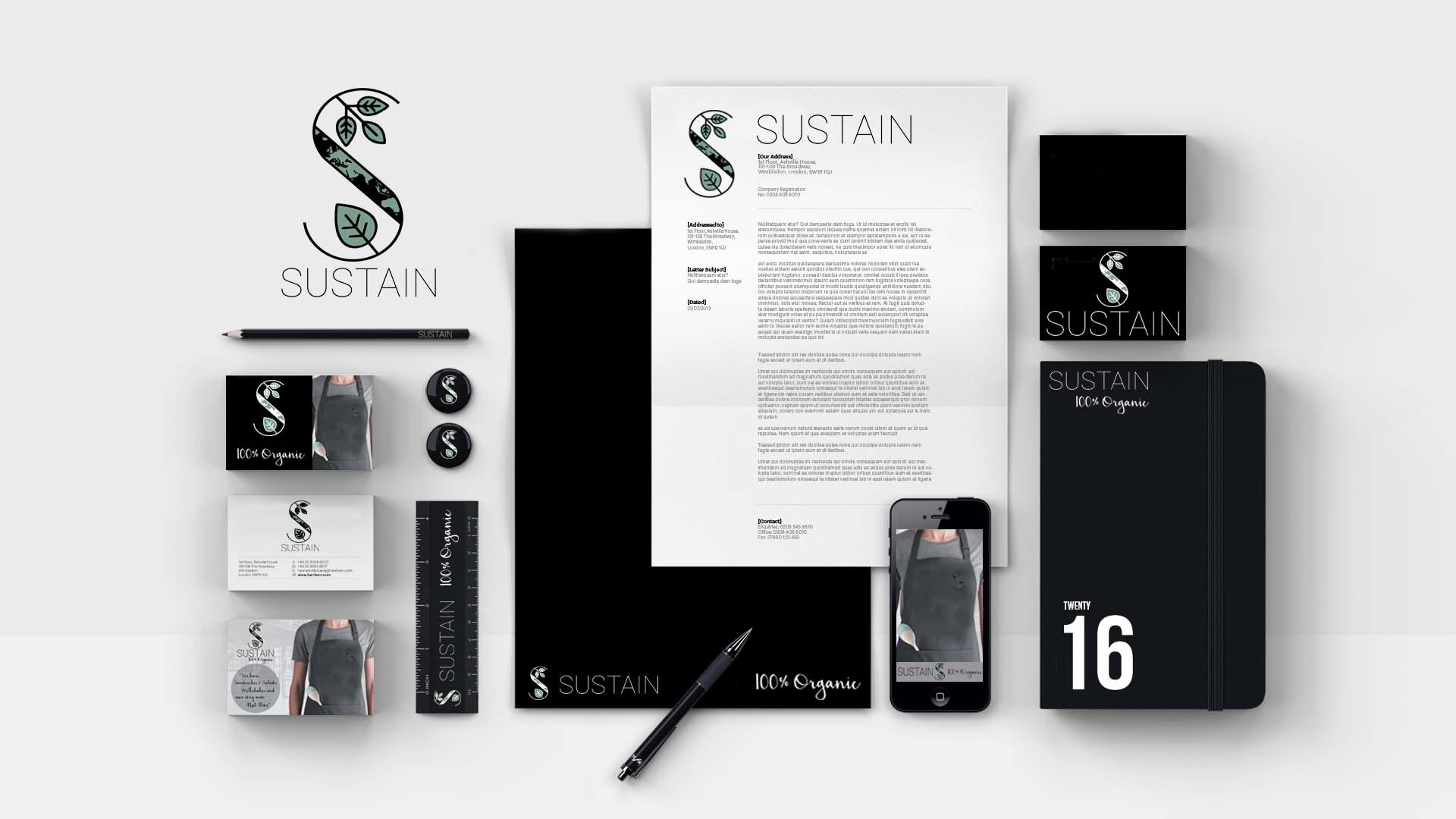
The above visualised steps are the simplified version of the overall process that went into one of my first brand identity projects. If I were to re-visit this project and update, I would look into more digital variations, apply the latest trends and expand the amount of visual presence for the brand.
Created by Gawshika Aumkaran
'First branding project as a designer'